

Showing posts with label Wilson Williams. Show all posts
Showing posts with label Wilson Williams. Show all posts
Tuesday, August 7, 2012
Congrats Gabby
This started out as a warm up sketch and I decide d to try and emulate the style of Miss Vanessa Newton. Of course I come up woefully short!!! She is amazing! But enjoy the image none the less! Congrats to Gabby Douglas!!!

Wednesday, August 1, 2012
I'm back!!!
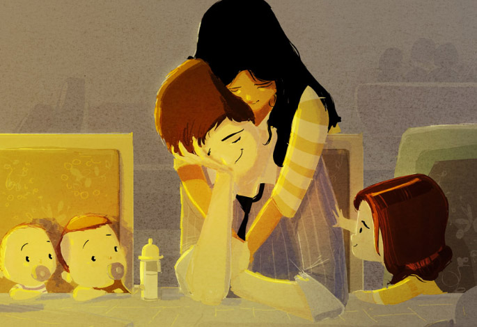
 |
| What I'm working on today |

Tuesday, August 23, 2011
Week 8 Collabo Coloring Sheet-Norman and Edrian
A free downloadable coloring sheet/digital stamp for this week! A new collaboration from the "Once Upon A Sketch" Group. Norman Grock and Edrian Thomidis. Norman provided the initial sketch and Edrian did the finishing inks. Enjoy!

Thursday, August 18, 2011
Week 8 Collabo Coloring Sheet-Aja and Wilson
A free downloadable coloring sheet/digital stamp for this week! A collaboration between Aja Wells and Wilson Williams, Jr. Aja provided the initial sketch and Wilson did the finishing inks. Enjoy!

Friday, August 12, 2011
Week 7 Collabo Coloring Sheet-Edrian and Wilson
A free downloadable coloring sheet/digital stamp for this week! A new collaboration from the "Once Upon A Sketch" Group. Edrian Thomidis and Wilson Williams, Jr.! Edrian provided the initial sketch and Wilson did the finishing inks. Enjoy!
Be sure to check out Edrian's blog! She has more freebies there!!

Be sure to check out Edrian's blog! She has more freebies there!!

Thursday, August 4, 2011
Week 6 Collabo Coloring Sheet-Wilson and Norm
A free downloadable coloring sheet/digital stamp for this week! A new collaboration from the "Once Upon A Sketch" Group. Wilson Williams, Jr and Norman Grock! Wilson provided the initial sketch and Norm did the finishing inks. Enjoy!


Saturday, July 30, 2011
Week 5 Collabo Coloring Sheet-Aja and Wilson
A free downloadable coloring sheet/digital stamp for this week! A collaboration between Aja Wells and Wilson Williams, Jr. Aja provided the initial sketch and Wilson did the finishing inks. Enjoy!


Friday, July 22, 2011
Week 4 Collabo Coloring Sheet-Aja and Wilson
A free downloadable coloring sheet/digital stamp for this week! A collaboration between Aja Wells and Wilson Williams, Jr. Aja provided the initial sketch and Wilson did the finishing inks. Enjoy!


Friday, July 15, 2011
Week 3 Collabo Coloring Sheet-Aja and Wilson
A free downloadable coloring sheet/digital stamp for this week! A collaboration between Aja Wells and Wilson Williams, Jr. Aja provided the initial sketch and Wilson did the finishing inks. Enjoy!
http://www.blogger.com/img/blank.gif

http://www.blogger.com/img/blank.gif

Wednesday, April 27, 2011
Beyonce-Move Your Body Video

New Video from Beyonce done in conjuncture with Michelle Obama's, Health Plan for Kids. She remixes "Get me Bodied" to be "Move Your Body" and choreographs the video with children in a school cafeteria. Which is funny because if I remember correctly Beyonce was home schooled so she never went to public school.
Ah well, her heart and message are in the right place and the video is fun. I love the little chubby kid. You can still be overweight and get down with the get down. I also love the brave young men that flank her to the left and right throughout most of the video.
I had my own dance in elementary school called the "Willie". (As coined by Miss Surhonda Williams) I only wish I remember what the dance was exactly. HA!!! Regardless, I doubt I could do it now anyway! Enjoy the video!
Thanks to Vik for posting this!!! Otherwise I would not have seen this!! :)
Intro and explanation from Bey.
Actual workout to learn to
Wednesday, March 23, 2011
Wisdom Wednesday-Pascal Campion
Inspirational Artists: Pascal Campion from Onyx Cinema, Inc. on Vimeo.
Please enjoy this video by Pascal Campion. He does an amazing job of conveying beautiful emotion through light and character in his illustrations. I aspire to bring this much feeling out in what I do. Enjoy and check out his work when you can!


Monday, March 14, 2011
Promo Process
A group of friends and I have decided to cross promote with one another. We'll be sending out promotional items every 3-4 months that advertise all of us as a group. But more details about that later! This image is my portion of our first promo. Here's the process!

Step 1: The assignment was given for my friends and I to depict mythological creatures of some kind. I selected the Bigfoot! The format was preselected so that all of our artwork would fit. The dimensions suited a large and looming creature. So I sketched up my idea and scanned it in to show to the group.
Step 2: After crit from the group I decided that the young man was too young and decided to up his age a bit. As well as change his style and character. I also needed to alter the dimensions of the image to compensate for the bleed of the promo. These revisions were done in Photoshop.
Step 3: At this stage I added some base tones to the image. Something to help define where and how everything would sit in space. This let me better define the heirarchy of the image.

Step 4: I start to lay in some flat tones to determine the base color of various items in the composition. I alter and play with these items colors using the Hue/Saturation tool in Photoshop. I decide to let the boys clothes be all primary and warm colors to help draw attention to him. And let the cool blue push the Sasquatch and trees into the background. The moon will serve as the bright beginning and the fire as the bright ending that pulls your eye from the top of the composition to the bottom.
Step 5: I begin laying in more distinct shadings and color. Defining my light sources and defining my shadows and forms. I then present this to my friends and crit group for input.
Step 6: One smart person notes how GREEN the image is. I note that I have concerns about how muddy the image may print due to this. They recommend toning down the green to some degree. Which I do using Curves in Photoshop. They also note a variety of other things; the proximity of the fire to the young mans shoes. The tangent created by the moon against the sasquatch's head. The warm tones showing in the upper area of the monster when they should probably be focused where the light source is.

Done: I address the issues mentioned and come up with this as the final product. The input of my peers and friends have helped elevate the piece to another level. Hopefully I can do the same on my next image! Maybe even better! Thanks so much to all my friends and peers for your input!
Friday, March 11, 2011
Promo Image start
This is my next promo image, almost finished. I'm throwing it at my Crit friends for input before I go in for final details and polish.

Things that have already been noted. I OBVIOUSLY don't know how to build a fire, I need stones around it. The fire is also too close to the poor childs feet. His shoes should be on fire! LOL! Now granted I'm not sure where I will shift the fire to that will still fit within the composition, but I'll figure that out as I go. Also the marshmallows should probably be getting roasted, uhmmm...a little bit! LOL! I'll get it fixed up!

As always Click for bigger image! Then Use Ctrl/+ to enlarge the image!
(Can be done multiple times.)
(Can be done multiple times.)
Things that have already been noted. I OBVIOUSLY don't know how to build a fire, I need stones around it. The fire is also too close to the poor childs feet. His shoes should be on fire! LOL! Now granted I'm not sure where I will shift the fire to that will still fit within the composition, but I'll figure that out as I go. Also the marshmallows should probably be getting roasted, uhmmm...a little bit! LOL! I'll get it fixed up!
Wednesday, March 9, 2011
Martha Stewart visits my Alma Mater
 Interesting. A friend posted this article form Martha Stewart who recently visited my old haunting grounds at Ringling School of Art and Design, now called Ringling College of Art and Design. (The above logo is the one they had when I attended!)
There's a number of pictures accompanying the article that document Martha's visit. Strangest thing is looking at how very, very different the campus looks now from when I was there. A lot of our old play areas are long gone. Rebuilt with newer, fresher buildings with more modern architecture and interior decoration. Looks nice but I think I liked the lived in and warm feeling and personality of the older places. (Don't get me wrong, if I had the money to go back and attend again. I would be there soaking it up like nobodies business in a heartbeat!)
I graduated with my BFA in Illustration in 1996. (Yep that long ago!) I loved the experience, but probably enjoyed the freedom and social aspects considerably more than the educational and artistic ones. Blame it on youth. I must go back and visit sometime.
I graduated with my BFA in Illustration in 1996. (Yep that long ago!) I loved the experience, but probably enjoyed the freedom and social aspects considerably more than the educational and artistic ones. Blame it on youth. I must go back and visit sometime.
I'd really love for them to start an MFA program. That would give me a GREAT reason to go back! I'd love to be able to get my Masters! But until then I'll keep exploring other options. (Below is the new logo for the school. Or at least I think it is.)

Thursday, March 3, 2011
In Progress-Run Thomas Run!!!
Latest Image I am working on as time permits. I need new images for my web site! Here's how it' s going so far! From sketch to almost done. All I still need to do is fix the background. It's a bit too plain for me now. I may put a fence, a crowd or just trees to the right and back. I'll put up those process sketches up as well later.


Tuesday, March 1, 2011
Famed Childrens Illustrator wins Oscar!!

The award for, oh excuse me, ACADEMY AWARD for Best Animated Short this year went to Shaun Tan, Childrens Book Illustrator and concept artist for films like Horton Hears a Who and Wall-E.

Please take the time to check out his work at your local bookstore or library. I am particularly fond of, The Arrival. A wordless book that chronicles the "Coming to America" experience but in an exotic and magical world full of strange creatures, architecture and function. A true testament to any artists storytelling ability is to do a wordless book. In The Arrival, Tan is at his best, building story, character, emotion and vision with his amazing pencil renderings and graphic novel style storytelling. You'll re-read it again and again and find something new every time you do!

To all the aspiring Childrens Book Illustrators and Authors, this just goes to show you how far our art can take you. Be inspired and stay motivated. Keep learning and getting better everyday!!
You can check out the full Animated Short of the Academy Award winning, The Lost Thing below.
You can check out the full Animated Short of the Academy Award winning, The Lost Thing below.
Monday, February 28, 2011
Return of Big Illustration Party Time

I'm very happy to report the return of Kevin Cross and Joshua Kemble's great podcast Big Illustration Party Time. After a year hiatus they start up not at the place they left off, but with new ideas, inspiration and direction about their lives, artwork and careers. It's great to see them back wiser and reinvigorated with a new energy to continue passing on their experiences to other Illustrators. Tune in and enjoy the Party!!!
Monday, February 21, 2011
Perspective Schmerspective!!!

I decided to pull this sketch that I'd done a little while ago to finish it up. Easy right!!? I need newer images for my portfolio. Images that are in line with the type of artwork I want to do.
Looking at the sketch I realized I had fallen into my old trap of designing right to left! So I flipped the image and went in to tighten things up. Everything was fine until I decided to do correct perspective on the room and block city. Jeezums!!! It is breaking me DOWN! LOL!
Does anybody have any ideas on how to get this to work better? Would the perspective on the block city be the same as the room. If so, it fisheyes SOO bad that it would make the room unreadable. When do you decide to forget the rules and just go with what looks ok versus what is actually correct and accurate? Everything actually looked ok until I decided to make it correct. Love to hear what you guys think!
Sunday, February 13, 2011
Jonah Coloring Book Cover

Here's the cover for my next Coloring Book. The Story of Jonah. This is Pre their designer adding type and whatnot! As well as some sketches from the interiors.
I'll let you guys know a release date as soon as I know and post a finalized cover as well. Enjoy!
I'll let you guys know a release date as soon as I know and post a finalized cover as well. Enjoy!


Wednesday, February 2, 2011
Wisdom Wednesday-Lynne Chapman Part 5
The final in a series of videos on the Childrens Industry by Lynne Chapman. Enjoy!
Up Next, Childrens Book Illustrator Will Terry!
Lynne Chapman on Sketchbooks from Open College of the Arts on Vimeo.
Up Next, Childrens Book Illustrator Will Terry!
Subscribe to:
Posts (Atom)