Tuesday, November 30, 2010

Banjo Pig-Sizzlin Bacon Proc. Part C


At this stage it's time to start laying in some base color. Now is when we try to get a lock on what the foundation colors of your image parts will be. You can start with whatever part of your image you like. For this I start with the background wave. I create a layer behind my wave linework and pick a color.
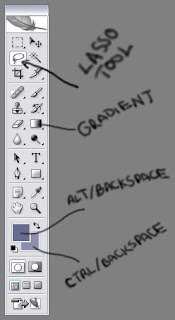


I use the lasso tool to trace the area. After you have made an initial lasso tool selection, you can hold down Alt while using the lasso tool to subtract or Shift to add. Use Alt/Backspace to fill with the primary selected color. Ctrl/Backspace to fill with the secondary color.
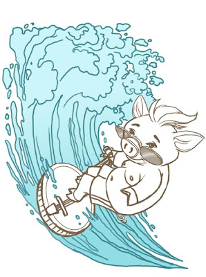


For these waves I chose to use a gradient that went from a medium blue to a lighter blue. Top to bottom. I want the line work to go on top. All the base colors will go beneath the linework and when I do final paints those will go on top of the linework. But that comes later!
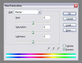


If I want to adjust these colors, I generally use the Hue/Saturation Tool. Ctrl/U or Image/Adjustments/Hue-Saturation. The top slide bar(Hue) adjusts your color from one end of the spectrum to the next. The middle slide bar(Saturation) affects the intensity of the color. Left removes color to the point of being grey, while to the right intensifies the brightness of the color. The bottom slide bar(Lightness) adds white or black to the color. Left adds black and right adds white.


I create a new layer behind the pig linework and fill in the colors here. Adjusting using the hue/saturation tool. These are only flat tones. No shading should be done at this time. I repeat and do the same for the banjo. If any of these colors feels off, have no fear as you progress and add more flats you can adjust again using your Photoshop tools.
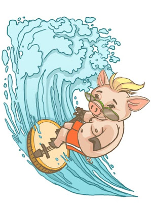


At this stage we start to figure out a light source and start to add in shadows to the flats. Once again these are done on a different layer. I play with the layer opacity to adjust for darkness and see which tones work best for my image. You should definitely take your time figuring out these portions. It's best to get these elements as solid as possible before moving on to the next stage. A solid foundation makes for a solid image!

Next up is painting those waves! Hope this all makes sense, if not let me know! Or if you know any shortcuts from what I currently do, let me know!

PART D is COMING SOON!! As always CLICK for bigger images!!!
Use Ctrl + to REALLY up the size!

PART A-sketch/final lines
PART B-Brushes
Sneak Peek Final Art

Visual Storytellers Studio


I was recently asked to become a member and contributor to the Visual Storytellers Studio. How cool is that? So you can find me posting images from my portfolio over there as well as my continued content here. Hopefully this will lead to even more connections with fellow Illustrators, prospective clients and enthusiasts!

Drop on by and check out the other Children's Illustrators who display their work there.

Enjoy!

Tuesday, November 23, 2010

GI Joe Renegades


G.I. Joe Renegades! Looks neat. I was never a big Joe fan when I was younger. (Much more of a He-man and She-Ra type of guy!) Stop LAUGHIN! But the last GI Joe TV series was pretty decent! This looks like it may be ok. I'm hoping they don't go anywhere near that horrid movie they just did. But the black skinny character sounds a lot like a Wayans Brother! Give me strength!

Saturday, November 20, 2010

Final Image-Banjo Pig-Sizzlin' Bacon


This is the final image of the Dueling Banjo Pig, titled Sizzlin' Bacon. I'll continue the process stuff next week so that everyone can see how I end up with the final image! I've submitted it to the Dueling Banjo Pigs blog. Let's hope it's accepted! I have a SNEAKY suspicion it will!


As always Click for bigger image! Then Use Ctrl/+ to enlarge the image!
(Can be done multiple times.)

Friday, November 19, 2010

Tricycle Press Closes


Trcycle Press is a publisher that develops off the beaten path children's books. Ones' that cater to multiple family types, characters and ethnicities. They are hardly what you would call safe. They catered to a very special and sometimes small portion of the population. But every part of the population deserves to have their stories told. Unfortunately it appears that they will be closing relatively soon.


The landscape is changing within the publishing industry.

Please follow the link to see a more detailed article about the closing of Tricycle Press by Literary Agent, Jennifer Laughran over on her blog.

Thursday, November 18, 2010

Young Justice!!!!!

Young Justice-One Hour Premier
Next Friday!!!!
6 Minute Teaser Below!


Tuesday, November 16, 2010

Banjo Pig-Sizzlin Bacon Proc. Part B

The Brushes

Let's go ahead and get the Brush thing out of the way. I know that seems to be very important to folks. (Me included) So for Part B, I'll go into which brushes I use in Photoshop. You can download my brushes at the end of this post!

I primarily work with two brushes in Photoshop. The brush that I use when I sketch and the brush that I use when I paint.


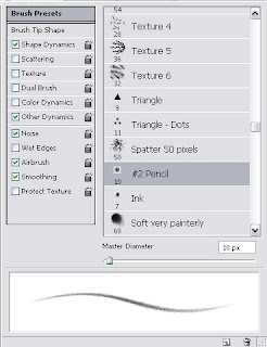
The brush used when I sketch is the #2 Pencil Brush. An artist on deviant art posted it and I downloaded it, among others, and loaded it into Photoshop in addition to the brushes that came standard. I like to work with the brush set to a light blue to replicate the color of pencil I like to use when I sketch. Non photo blue! But other light tones work just as well. Again this aids me in the non permanent feel and helps working with the tablet feel familiar by reproducing the look and feel of the tools that I use when sketching traditionally.

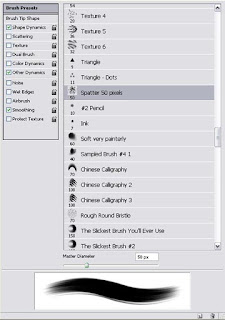
Ok, I figured out the ORIGINAL name of the brush that I use to do most of my painting in Photoshop. I use the 50 pixel Spatter Brush. The settings I use are the standard ones set when they arrive with the Program. I like that it can give a rough and painted feel if wanted. Though I have yet to get that to my satisfaction! So more experimentation is warranted!


I get the most variance in texture and application from the brushes by varying the Opacity. My go to settings are 5, 15, 25, 50, 75 and 100 percent Opacity. 50, 75 and 100 when I am blocking in the colors. 5, 10, 15 and 25 when I am blending them together. This works out best for me in conjunction with varied layer effects and whatnot.

To get good blends I pick one color to blend with and eye drop it. Then with the Opacity set to 25 or 50 percent I paint slightly over the color I want to blend to. Then I eyedrop the color created and repeat the process lightening the Opacity as I progress. If I really want the transitions smooth I'll go all the way down to 5 percent, but I rarely need to go below 15. The chunkier you want the color transitions, the higher the opacity you use. The eyedrop tool is your friend, well it's mine anyways! As is Quick-Keys, learn em!!!


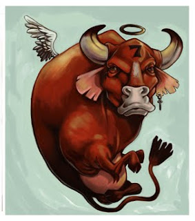
To the left is the first image I freestyle painted in Photoshop. Before that I used a system of curves and channels that is common in the T-Shirt and print industry. So experiment, learn and repeat over and over again. The one thing you can't do is get worse!

I've uploaded my brush set and it is here to be downloaded! This set includes the standard brushes that come with Photoshop. So I advise saving your Brushes before you load new ones in! Enjoy!

Back to painting in Banjo Pig-Sizzlin Bacon Proc. Part C, coming soon!

Monday, November 8, 2010

OOoo Weeee!!!!

I'm gonna shetup and let the video do the talking! Some of my favorite soul singers!
MY NAME IS PEACHES!!!!
You could catch the Holy Ghost off this!


Had to replace the video with another source, it got yanked from Youtube! This song was originally done by Nina Simone and is called,Four Women. The lyrics are below.

Four Women
by Nina Simone

My skin is black
My arms are long
My hair is woolly
My back is strong
Strong enough to take the pain
inflicted again and again
What do they call me
My name is AUNT SARAH
Aunt Sarah

My skin is yellow
My hair is long
Between two worlds
I do belong
My father was rich and white
He forced my mother late one night
What do they call me
My name is SAFFRONIA
Saffronia

My skin is tan
My hair is fine
My hips invite you daddy
and my mouth is like wine
Whose little girl am I?
anyone who has money to buy
What do they call me
My name is SWEET THING
they call me Sweet Thing

My skin is brown
and my manner is tough
I'll kill the first mother I see
'cause my life has to been too rough
I'm awfully bitter these days
because my parents were slaves
What do they call me
My name is PEACHES

Banjo Pig-Sizzlin Bacon Proc. Part A


I have been asked by a few folks what my process is for working digitally. So I'll be posting it here in parts! If you need more details or are confused about anything then let me know and I'll try to explain better as an addendum or in my next post. So, let's get started!!!

First of all the sketch can come at any place or any time. Especially since we artists can be inspired at the strangest time by even stranger things!

This sketch was done while I was waiting outside in the car for my Mother to get some bloodwork done. I'm sure I am like many of us that we keep a notepad, paper, and pen or pencil in our vehicles at all times. No? Well you should!

Afterwards, I scan the quick little doodle into the computer. Since I know that I am going to be redrawing the image, I don't need to scan it at a high resolution. 100 dpi works just fine thank you!


In Photoshop, I put the sketch on it's own layer in a file that is still around 100-150 dpi. I drop the opacity of my sketch to 20-25%. Then I create another layer on top of that. On this layer I go in with my #2 pencil brush and redraw the image. Fairly quickly tightening up the idea and solidifying some of the elements I wasn't sure of in the initial scribble. (Like getting rid of the pig wiping out in the background.)

If I am satisfied with the new drawing and I am ready to move to a tight pencil, I up the resolution of the image to 300dpi and continue with the next steps.

I repeat the process again. I hide the first doodle layer and drop the opacity of the pencil sketch layer to 20-25%. I will now be drawing components on multiple layers. This helps me change and reorganize things for the purpose of composition and size.


So my layers will be as follows: Layer 1:Surfin Pig, Layer 2: Banjo Surf board, Layer 3: Waves in background. At minimum I almost always do foreground, mid and background layers for my images. Be forewarned, I am a layer piggy! Luv my layers!

I create a new layer on top of that and draw an even tighter final line of the parts in their own layers.

For this stage I use a standard brush that comes with Photoshop, at some point I managed to erase the name of it, so I can't say what it's called! I'll post an image of it later! Because it's the same one that I use to paint the image!

I use the Hue/Saturation filter to change the color of the linework to what I feel is suited. I rarely if ever work on black line art, be it in physical or electronic mediums. I then play with the sizes, angles and composition of the individual elements before moving on to the next stage! Which we'll do next time!

Hope this all makes sense, if not let me know! Or if you know any shortcuts from what I currently do, let me know!

PART B is COMING SOON!! As always CLICK for bigger images!!!
Use Ctrl + to REALLY up the size!

Friday, November 5, 2010

Eric Canete


ELECTRIC MAYHEM_commission by *KAH-reload on deviantART

WOW!

Eric Canete rocks my socks! His fluid and majestic sense of line and space is amazing. So organic and filled with energy! It also doesn't hurt that he seems to always take on some of my FAVORITE characters and interprets them in ways that makes them fresh and new without having to re-interpret their costumes or personalities! Great stuff!


HELLBOY and WONDERWOMAN by *KAH-reload on deviantART


TONY STARK_commission by *KAH-reload on deviantART

Michael-Kadir Nelson


I have been a long time fan of Kadir Nelson. This is a great new piece of artwork that is an inspiration! Kadir was commissioned to do the new Michael Jackson album cover. Which releases all the newest material completed by Michael. Kadir is a great example of the many places that Illustration can take you. We just have to keep improving our game.

I only want to get better and better so that more and more opportunities will open themselves up to me! So congrats again to Kadir! I always anticipate more work from him!


Album artwork is yet another avenue that many Illustrators may have forgotten about where potential work exists. A friend of mine, Derek Gores, did many GREAT album covers for rock bands for years! Great business and a great way to promote yourself in venues across the globe! How many of us had posters of the album covers we liked when we were younger?

Really get to know the industry and see the potential avenues that exist within it. Then set your sights! All of the venues have their own sets of rules and obstacles. But in the end the more you explore the more likely it is you'll find a niche that you can stand out and shine!

Monday, November 1, 2010

New Books!!

I just got two of my latest books/workbooks. They are for the educational company, Curriculum Associates. I was not the only Illustrator on these, so it's neat to see how other artists visualized similar materials.


Getting published work is a great time for me! I've had enough time between completing the work and seeing the finished published work to get a decent amount of separation from the artwork. This allows me to be much more subjective about it. What was done well, what could be improved and what I will never do again! Ha! As artists this is integral to us improving and becoming better at what we do. Every opportunity to learn and grow must be taken! Our skills need to always be honed and advanced!


If I'm lucky I will never have a job come to me that I am completely satisfied with.