Wednesday, December 30, 2009
Wisdom Wednesday
Today I'm gonna share an amazing find!
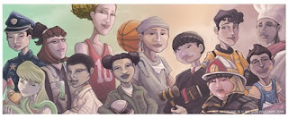
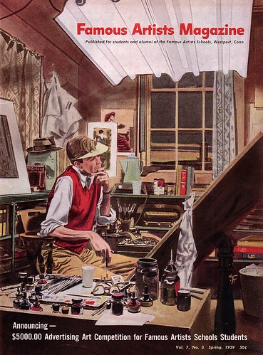
Animation/Film Student Daniel Caylor(pictured below), has posted on his blog the contents of the Famous Artists School Correspondence Class 1960. What is the Famous Artists School? The Wiki page desribes it as follows:
"Famous Artists School has offered correspondence courses in art since it was founded in 1948 in Westport, Connecticut, U.S.A. The idea was conceived by Albert Dorne as a result of a conversation with Norman Rockwell. For the founding faculty, Dorne recruited John Atherton, Austin Briggs, Stevan Dohanos, Robert Fawcett, Peter Helck, Fred Ludekens, Ben Stahl, Al Parker, Norman Rockwell, Ben Stahl, Harold von Schmidt and Jon Whitcomb. All were making more than US$50,000 a year at the time, roughly equivalent to US$425,000 in 2006.[1] Later faculty included cartoonists Al Capp, Milt Caniff and Rube Goldberg. Advisory faculty for the school later included Stuart Davis, Ben Shahn, Fletcher Martin, Ernest Fiene, Arnold Blanch and Doris Lee."
The compilation of this course is hard to find. So Daniel Caylor taking the time to purchase, scan and upload it's contents for the betterment of the art community is a huge blessing. Please drop by the blog to offer Daniel your thanks! And enjoy the download from these Masters of our industry!
Enjoy!
-Wilson
P.S. On another historical note in regards to the state of our industry. Looking at the equivalent of what those artists made compared to now is astounding!! Granted there are still some artists that make these amounts, but most not without a significant amount of marketing and licensing. But the other element is that a lot of these artists were Rock-stars, household names in their times. When people saw their artwork they knew who did it and remembered them and talked about them. Kids cut the images out and put them on their walls.
Today people still see and acknowledge beautiful artwork, but they don't care or acknowledge the genius behind their creation. So many amazing artists that only we have the joy of knowing and recognizing their names. Those type of people are my celebrities. And they deserve to be paid and treated like it!
I have fan moments whenever I get an e-mail or response on my blog from someone who's artwork inspires me and gives leaps to my imagination. In a way, some of the changes are to my and your benefit. Were our artists regarded in the same way as Norman Rockwell, I doubt they would have the time to respond to every artist who aspires to be as great as them some day. (They would be over run with letters! Though I don't think they would mind it too much!)
So please make use of the changes that this world has brought. We are closer than ever to our heroes, muses and teachers. Let them know that their hard work and talent is not going unappreciated. That they bring you inspiration with all that they do. Our artists today may not be making six figure salaries, but we can let them know that they are helping to bring in the next generation of artists and visionaries.
Happy New Year guys and ladies!!
Friday, December 18, 2009
Beulah's Red Boots and Magic Lasso
Remember this image from WAYYYYYYY back. Well I wanted a break from Chef John so I decided to start finishing this up. The WIP is below. I think I have the background done and need to finish off the main character and add in the others. The little girl to the left is named Beulah. And yes she is as strange as her name. This image is her having a playdate with another little girl, Beatrice(to the right). Who is dead set on making Beulah dress and act like a proper, young lady! Well you can see how well things are going! LOL!
The image below is with a white fade added that would allow for type. This would be a double page spread. Let me know if you think it's necessary or not. Thanks guys!!
As always click for bigger images. Hope everyone has a wonderful holiday if I don't check back in before then!!
-Wilson
Sunday, December 13, 2009
Hey Good Lookin' Whatcha Got Cookin'
Wednesday, December 9, 2009
Wisdom Wednesday
My post on this Wisdom Wednesday is about a Blog/Podcast that I enjoy listening to on a weekly basis. Escape from Illustration Island. I have been a fan of it since it's inception! The website is described as follows on their website:
Escape From Illustration Island is the brainchild of Thomas James, an Illustrator located in Portland, Oregon who works tirelessly to provide useful content, encourage community participation, and help Illustrators escape their isolation through this site and its audio accompaniment, the Escape From Illustration Island Podcast. Although Thomas is responsible for the creation and maintenance of EFII, he shares the credit for its success with the many Illustrators who contribute and interact with each other on a daily basis. You can find Thomas’s Illustration work at thomasjamesillustration.com.
Of great interest to Children's Book Illustrators is a recent podcast interviewing Holli Conger, the prolific Children's Market Illustrator and owner of multiple websites including, but not limited to;
Holliconger.com
Agirlwhocreates.com
junkadoodles.com
illustrationforkids.com
illustrationforkids.blogspot.com
I highlighted Holli's work earlier in my blog and it was great to hear her interviewed on this podcast and hear of her experiences and wisdom. Definitely take some time to drop by EFII, you won't regret it!
-Wilson
Chef John and the Runaway Produce Section
After I post this image I think you will understand why I may never want to see another fruit or vegetable again as long as I live!! LOL!! But no, not really. This is the next Chef John illustration. So far I have three done, but I think I may drop one of them in favor of something else. Below are the other stages I've posted as I've progressed. The last is the "final" image. I still may tweak it some more depending on the feedback I get. And I intend to add it to my webpage by this weekend, Then it's off to the next image of John. Which will probably be the one of him over the pot!!)
Thursday, December 3, 2009
Heya Folks!!
Another Chef John piece is in the bag!! I was very proud of this one because, "Ooh look a background!!!" LOL! I had to go back to my perspective learning's of yore to lay out everything and get the floor tiles and counters correct. Time consuming, yes, but also very rewarding. It makes me more confident with the final product! I'm glad to be done with this one and able to post it up! The older version was put up in this post. Do you like it better now guys?
I'll be either revisiting the previous Chef John piece or removing it entirely and doing a different one for the third in this series. I don't think I need two pieces with Chef John and the fruit dancing behind him. I think the one I'm working on now is more impactful and cancels out the initial one I'd done. I also have a friend working on a script to go with the story! So fun stuff all the way around.
The next Chef John piece is in progress and I posted the WIP below. And I look to finish it up by the end of the weekend. After that I need to work on some more interior images and narrative pieces. I see a classroom picture or family eating dinner in my future!!
I thought I knew all my fruits and veggies but I found myself wanting to go to a market to get ideas for other things to fill the spaces. I want to have fruits and veggies that kids can look at the images and easily identify. I wouldn't think that anything too exotic would be a good idea. The most exotic I'm going is jalapeno peppers and mangoes.
I have also composed my first mailer. And after much research I have decided to go with Premium Postcard. I like having the ability to send as many as I like (print on demand) And that I can upload my mailing list and quickly and easily send out mailers to a variety of clients. You know make an educational publisher mailing list and a children's magazine mailing list. I won't have to order a gazillion of em and just have them sitting around staring at me!
The only drawback is that I definitely foresee me needing to have some postcard size samples to have handy for submission packets and portfolio reviews. But this service should allow me to get my mailers out quickly and specialize who they go to with a much smaller investment on my part.
I just sent myself the first one just to see how they look before I send them to potential clients. I'll post here to let you guys know how they come out!!
I also found a couple of AWESOME blog posts where some Illustrators gave a lot of great information on how they go about creating and mailing there mailers. Check em out when you get the chance!!
Aja Wells-Great blog in general from this great Illustrator!! She always puts up lots of great information and wonderful insight into her process. Definitely check her out!
Holli Conger-What an inspiring and amazing artist she is! Once again, full of information and insight. We can learn a lot by watching the process and success of others!!
Later later guys and gals!!
-Wilson
Wednesday, November 18, 2009
Wisdom Wednesday
Wow, It has been awhile hasn't it. My Blog has seen better days and I miss corresponding with my friends in Blog land! So have no fear I am on the way to rectifying the lack of posts on my site.
It has been a tumultuous few weeks. I recently got laid off from my full-time position of the last twelve plus years. Yikes! (Thanks Economy!) And now I'm in a position that I need to figure out what direction I want to go from here. That thinking process and mining the area I live in for potential employment has eaten up all my time and energy. While I have yet to come up with a definitive solution, I have decided that being let go is an ample opportunity. If there was ever a time in my life for me to decide what it is I want and what I want to do, THIS IS IT!
I have a hunger to break into the children's industry and I also have a desire to see what it's like to work in other artistic environments. (I also have a large desire to pay my mortgage and bills!!) What's it like to work surrounded by another group of artists, in a different Art Dept. with different goals, ideas and expectations. How exciting and fun could that be!? Well in the process I have run across a new resource that I want to post here for everyone's use.
Linked In is a networking site that I actually signed up for a long time ago. I just never really invetsigated it or kept up with it. Well, I have found out through further investigation that it has a lot to offer. I was surprised to find how many past clients, colleagues and friends are a part of this network. I've been able to look at friends past clientelle and their contacts. I've also been able to get lists of businesses local and nationwide that deal within the specific industry I am researching. And get specific names of contacts at that company, be it through a friend who has worked with them or sending a letter to someone who used to hold that position at the company. Great asset when used creatively!
Their are also a number of groups within the LinkedIn system. A number of which are dedicated to the Children's Publishing Industry. I have yet to search for groups dedicated to apparel, could be interesting! I myself am a member of 9 groups. One of which happens to be SCBWI, yes they have a prescence on LinkedIn as well.
There are also jobs listed that you can search by your chosen profession and also a notice that tells you how many people have looked at your profile in the last 15 days. While it doesn't tell you specifically who, it does tell you where and what industry they are then and then lets you search those specifics to see whom the possible viewer might be. ;)
Here's a link to my page on LinkedIn. If you sign up feel free to link up with me! Hopefully we can all help each other to do better!
I'll be back with more later folks! Wish you all the best!!
-Wilson
Tuesday, October 13, 2009
Wisdom Wednesday
Heya folks!!
Above is my post for the word "Flying" for Illustration Friday!! It's just a sketch right now and I am working on tightening it up to submit to something later on. We'll see!! I'll post the final image when I'm done!!
Many times I have drawn a character and had someone say to me, "Oohh she looks Cuban." or "Oooh is he supposed to be Irish?" And often I don't have an answer for them. Most times I'm drawing characters as I see them in my head and I'm not really thinking about their nationality. But if I got an assignment and needed to draw an Irish person or a Polynesian person, how could I easily go about doing that accurately?
Being African American I am very familiar with the generic qualities and traits that make a person look like they are African American. But what about Chinese versus Japanese, vs. Tibetan vs. Vietnamese vs. Korean vs. Malaysian!!!! All are similar but different and have there own distinctive facial features and body types. Is there a book on this that I can snag? How do I get something that's fairly thorough? I searched and found books that would list general races and they barely skimmed the surface of the spectrum of ethnicities that encompass the globe. African, Asian, Caucasian and Latin seemed to be as deep as anybody went. But then one day I got very lucky!!
I am a member of a website called DeviantArt. An online community for every kind of artist there is. Very often people will post tutorials and show other their process through images or video. At the time I was looking for a tutorial on adult vs. children proportions. (You know, how many heads tall is a five year old versus a twelve year old and so on.) Well I found it, but I also found that this particular artist also had created a number of amazingly informative and thorough tutorials on varied ethnicities across the globe!
Hallelujah!!!
Her screen name is Cedarseed and her actual name is Joumamna Medlej. She is a Lebanese graphic artist and Art Director and she has put together a number of wonderful tutorials on a variety of subject matter specific to drawing. But in this post I'll focus on the ones that center on human types.
There is a set of three titled the, "Guide to Human Types." She begins each with an explanation of why this study is so valuable to artists then breaks down into the varying ethnicities. She starts with a general model, (Asian for example) and gives the general body types, height comparison male to female, eye, skull, nose and facial shape. Then gets into the varied Asian ethnicities and the traits that separate them from the general model. Such as eye color, skin color and hair color. All wonderfully illustrated and meticulously presented!
Guide to Human Types-Part 1
Guide to Human Types-Part 2
Guide to Human Types-Part 3
Guide to Human Types-Addendum
If you print these tutorials out you will find that they are quite large and would work well hung above your desk for quick visual reference if you wanted. If not, she has compiled a number of her tutorials and offers them for sale through her website. (I will be ordering one myself soon!!)
She has a number of other great tutorials as well! And I have every intention of highlighting those in the future. But if you want to get a jump and start investigating yourself, just check out her page that has links to all the tutorials she has created up to this point and enjoy!!
-Wilson
Tuesday, September 29, 2009
Wisdom Wednesday
Jolle directed me to the website of Mr. Scott Franson. An illustrator, designer and Professor at Brigham Young University. His first Children's Book, Un-Brella, was published in 2007.
The pdf I was directed to was a Portfolio Evaluation Form that goes over all the areas of a Children's Book Portfolio that an art director looks at and evaluates. The form gives a scale to rate your level in each category and then a scoring tally to determine how close or far you are from being employable within the industry. WOW!!!! I immediately printed this form out and after a thorough going over realized that I was in deep. It pointed out a lot of areas that I was weak and a lot of areas I hadn't even considered!! What a great tool this was! But it didn't stop there.
Mr. Franson also provided links to a number of conferences and organizations that dealt specifically with the Children's Publishing arena. This is how I found out about SCBWI for the first time. This was also the first time I even knew that conferences of this nature existed!! How excited I was at all these amazing possibilities and resources. I was learning that I was not so alone in my quest to break into children's books and that their was a supportive community that I could tap into. How amazing a find! ...But it didn't stop there either! LOL!
Mr. Franson also provided other PDF's. Templates for various size variations and dummy setups. (Vertical, Horizontal, and Square) He provided guides that showed various ways to layout information and illustrations on your pages. And also a Picture Book Anatomy sheet that shows how Picture Books are constructed and setup. But there's still more!!
Mr. Franson has recently restructured his website and all the old links that I would go to have been relocated into a section of his site called Children's Publishing 101. All the wonderful information is still there and he has provided even more!! There are now a series of great articles that he has written exploring Visual Flow and what Storyboarding is and how it benefits the Artist. Amazing and great information throughout!
Please take a moment, (though I recommend a great deal longer) and peruse what Mr. Franson has setup and check back regularly to see what new tidbits he adds as he continues to provide wonderful information for those of us seeking to better our skill sets and knowledge base within the Children's Book Industry.
Mr. Franson's older blog is here. He has a number of great posts that warrant going through but anything newer from him will be at his blog's new location on his website.
Enjoy guys and thank you Scott for providing such a wellspring of information and inspiration.
Please note: All artwork in this post is copyright Scott E Franson
-Wilson
Friday, September 25, 2009
Character Study-Singing Chef John
So, I thought I was done with the first image of Chef John and was almost done with the second.(see above) I was in the process of painting John when I decided to see how the characters compared to one another when I put them all in the same file and looked at them side by side. AAAAAAUUGGHHHH!!!!!
Well first of all, thank goodness I did it. But second of all, most of them looked either like completely different kids or older versions of the same kid. Which is not good. The ones that looked the most consistent were the latest sketches I'd done all at or around the same time (the last few images in this post). Problem is they looked very different from my original image(first image in this post). And the second image I was working on looked like the older brother of the character(above).
But this offered me a great opportunity to start figuring out how I would go about keeping my characters consistent. I decided to use Photoshop to my advantage. I used it to create the character sheet you see below. This week, I stopped and figured out the proportions and characteristics of Chef John from front, side, back and 3/4 angles. I used his bald head as a measuring tool for his proportions. And added his clothes and accessories on different layers as I moved forward. I looked up anatomy charts to see which parts should line up with what and used the guides in Photoshop to make sure everything lined up as I rotated him. And also did a number of expression studies to get a better feel for his personality. Some expressions suited him and others didn't feel at home. Which is good to know!
Please click on image above to enlarge.
I can only hope that I did it right! Since this is my first time making one I'm sure it's not 100 percent and I may have a lot more here than I need. Potentially not enough. But at the end of the day, I know what he looks like from a large number of angles and I have a resource as I move forward with completing and revising my previous images and sketches. This also gives me a chance to go back into the earlier images and make some of the suggested changes I got from other artists.
I feel that most of my sketches are on point as far as gesture and stance are concerned with John. I plan on copying the sketches of him into one Photoshop file, redrawing them based on my character sheet and coloring and painting them all at the same time. I think this will maximize the potential consistency of John and make sure that he always looks, feels and acts like himself throughout all the images. When I'm done painting the Johns, I'll copy them back into their original images and recolor or paint them to fit in there environments.
I hope it works!!
And if you folks have any other suggestions that you think may work, please feel free to comment them to me!!
Thanks and have a good weekend!!
-Wilson
Tuesday, September 22, 2009
Wisdom Wednesday-The Wisdom of Jolle
A few posts ago I talked about plaing artwork on forums to get input from your peers. A place I mentioned was the DrawingBoard. There was one particular person that I ran across on those forums whose crits were so insightful and eye opening that it made me happy to get my work torn apart by him! LOL!
He goes by the name Jolle De Wit or Guardstone. He is an Art Director, Designer, Developer, and Illustrator who resides in the Netherlands. And he seems to be a sincere and great guy! His crits have been phenomenal and I want to start putting some of them up to give examples of what good crits can be like. He's always honest and sincere and I have come to respect his words a great deal.
I'll start by just posting verbatim the interactions that transpired bewteen he and I on the forum. Enjoy!! I did!! I'm in blue and he is in red! Also, I only posted the image that he specifically critiqued and not all the images I posted.
Just a couple of quick notes:
- For a children's book portfolio, be sure to include some animal illustrations
- Also, children's books are sequential: characters can be seen throughout the story, so be sure to show you can tell a story in more than one illustration and that you can draw the same character according to model in different situations and poses. In other words, be sure to include 3 drawings from the same story. [edit - I see you have plans there, good]
- Nothing wrong with a blue sky here and there, we're talking children's books!
- Any single illustration should tell me what the story is about.
Finally, am I right in thinking you're left-handed? It clearly shows, all your characters are skewed to the left, some even almost tipping over (right-handed illustrators often have the same problem in the other direction). Since you're working digitally, you can easily prevent this while working by flipping your canvas horizontally every so many minutes, this will instantly show any unwanted diagonals.
One more remark: making 20 pieces and cutting to ten is still a bit on the small side. Make like 30-50 and pick the best 12-15 out of those.
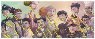
Well like I said, flipping your canvas is one way to spot it, butit could very well be that you don't. It is quite difficult to explain, so here's a few quick traces that may clearify my point.
As for your list, looks like you're heading in the right direction. You may find this PDF very helpful as well. (That PDF will be a topic on a whole other Wisdom Wednesday! Stay Tuned!!)
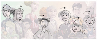
Notice how many of your necks lean forward/backward/to the side. That's fine if you mean it like that, if the character has reason to do so, but I'm guessing that's not the case here.
themightykwan wrote:
I will be very aware of that from now on and see in what way I can address it in the aforementioned piece!!
Once again, thanks so so much!!! I deeply appreciate you imparting your knowledge upon me!! Please continue to do so as I move forward and post more stuff!!!
Friday, September 18, 2009
Mmmmm.......
I am attempting to put up a short post! At least once in my lifetime!
I saw this cute little video and thought how amazing the range of expressions and gestures are that children emulate all by themselves with no adults or others present. You could freeze frame any portion of this and just get an amazing sketch out of it!! Definitely something to study!!
As far as the video goes. I feel blessed. I never had any affinity for marshmallows, unless they were melted and in Rice Krispy treats or Rocky Road Ice Cream. So I never got the Peeps fascination either, LOL!
Enjoy folks and have a great weekend!!
-Wilson
Thursday, September 17, 2009
Getting some continuity
Adults, Parents, Grandparents
Interior scenes
Character continuity pieces
Interaction of multiple characters
This has made me take the pieces I had in process off my plate and choose to focus on the areas that I know are lacking. Now, most of you probably know that one of the most important elements of your Children's Book portfolio is character continuity. Your ability to draw the same character in different settings and situations yet remain consistent in appearance and demeanor. This is a BIG hole in my portfolio, so I am focusing my efforts there.
I decided to do multiple pieces of the Chef John story. Largely because I already had a second image sketched that I had yet to complete. For the past week or so, I've been working on that second image (sketch below) and I will be putting some of that process stuff up within the next few days. I'm still not done though, maybe next week or so. And yes I have had to fix his facial structure and body type a bit since this sketch!! LOL! I'm working hard at getting the character down before I go too much further! It's a lot harder than it looks!!! (Which is why it's so important.)
In the meantime I did the four sketches you see below. I need you guys help in deciding which ones to take to tighter sketches. I want to have three or four pieces in my portfolio from the same story (not including an eventual dummy of some sort.) So at most I will need two of the four images, unless you guys think I should have more. But check em out and let me know what you think and which you would go with. Also let me know if there are any glaring character inconsistencies. Also note that none of the characters other than John repeat in the other images. If some folks look way too similar to each other let me know!
Please enlarge these to get a better look at them.
Thanks,
Wilson
Wednesday, September 16, 2009
Wisdom Wednesday
I think I took for granted that most minorities were being represented within the industry. And when I say represented I don't mean standing in the background or the best friend of the primary character. I mean the numero uno character and family that the book focusses on. It seems like I see a lot of books that center on Latin, Asian, Jewish or African American culture. (Which always makes me think of how much research I would have to do to properly illustrate some of them. Which actually is quite exciting!) But maybe I notice it so much because I am looking for it and seeking those companies and publishers specifically since I myself am African American.
A lot of my reasoning for considering the children's book industry to be different was in what my research showed me. A prerequisite of Art editors and directors is to see your ability to draw varied ethnicities, body types, ages and genders. Seeing as how this was a pre-requisite for entrance to the "kingdom". I find it disheartening to learn that 95 percent of the product being placed in the market is not reflective of this. The article speaks towards the lack of African American precense. But I often worry about other minorities as well. It's so important for children to identify with heroes and heroines that look like them and come from the neighborhoods and families that they know and understand.
I can personally testify to how hard it is to have the same people who treat you harshly in reality be the only option of heroes that you have to emulate. Which often leads to a person wanting to be like and identify with the same people they find tearing them down on a daily basis and in the end never really liking or loving themselves.
Knowing that I could be a part of a community that works to provide heroes for everyone is a large reason why Children's Book are so attractive to me. I know the amazing impact these things can have on children and I want to be a part of it. So let's make sure we all work toward providing product that every child can come away from feeling special and honored.
-Wilson
Thursday, September 3, 2009
Lion and Mouse Thursday update
On Monday I did like I said I would and focussed on finding reference for the mouse. An African Striped Back mouse to be more precise. Don't you just love the internet for reference! Upon finding image that showed me what I needed to see of the mouse I copied those files into Photoshop and put them all on their own layer. I then made another layer and started sketching the mouse out. I decided to keep the mouse in roughly the same pose as before, hopefully this time a lot closer to being anatomically correct! And also hopefully this time with a little more character and personality to really capture the intent of this moment in the story.
On Tuesday I started to fill in the colors of the mouse. And lay down shadow tones and shading to help ground him. I spend a lot of time adjust the mouses size. His height and plumpness bugged me from the previous day. So I slimmed him down a good deal and adjusted his positioning. I thought I was done with that part but found out I was very wrong! You will note that in later images his size and weight still change some more as I go on.
Wednesday, I feel safe to start going in and working tight on this piece. This is definitely a benefit of working digitally at a decent DPI. The ability to really zoom in and get as much detail as you could possibly want. I have learned that when I want large sweeping strokes I zoom out and use large brushes and the opposite for detailed portions. But it's important to zoom out to 100% (actual) size. To make sure that the level of detail you are executing is worthwhile. In many instances you will spend a lot of time on details barely noticeable at normal size. So be wary!
Thursday it looks like I will actually get to finish this up! I go in and finish out the details of the mouse. Who with those stripes looks like the child of a mixed mouse and chipmunk marriage! I really enjoyed doing the fur on the mouse! Good times! Once done with the mouse I use the Adjustment tools to make color corrections to the mouse. Removing a lot of the yellow because he wasn't standing out at all. He was getting lost in the image. Even with this adjustment I end up placing a lighter color silhouette around a part of him to help him stand out from the background. AFter adjusting his color, I apply an adjustment filter to the entire image. Enhancing the Saturation slightly and deepening my shadows and pulling out more of the highlights of the image. And I call it a day! Yahoo all done for now!! But there is one thing left to do....
I still have the original image in the Photoshop file on it's own layer. I move it to the top and spend a while turning it on and off. Looking at the image from 13 years ago and comparing it to the one I've just finished. This is what a difference 13 years makes. I consider myself lucky that there is any difference! I know many folks who haven't grown or changed in style at all in the years since college.
I can see some elements in both that I like, some elements that existed in that young person fresh from college are evident in the image. While now it's obvious that I have changed a great deal. It's still me, you can still see my hand in what I do. But you can definitely see change. Whether people would consider it growth or not is a completely different thing. But I like what I see and I am proud of the difference. It lets me know that I am going in the right direction, my direction. So I got a lot more out of this than I'd hoped. And it's renewed that ember of confidence that a lot of artists struggle with. Now all I have to do is keep it lit!
Wednesday, September 2, 2009
Wisdom Wednesday
I'll highlight two in particular that are fairly popular and see a decent amount of traffic. High traffic is good because it means that many more people will see what you are working on.
The first one is The Drawing Board. These forums are largely populated by student artists and professional Illustrators looking to get input and hopefully praise on what they are posting. I most often gravitate to the Illustration forum, but there are also forums for Life Drawing, Sketches, Caricature, Superheroes, Comics, Photography as well as many others. This site is great for networking and getting inspiration from the many talented folks that populate it.
Only thou of thick skin need enter here! Next up is not for the faint of heart! LOL! So often you post images hoping to get good feedback, insight and criticism. (Well I do anyways.) And sometimes in an effort to not hurt your feelings or ego people say nothing or only tell you that your image is great. This is not those people! These guys are dedicated artists who take what they do seriously and expect the same from you. I mean, how else are you to grow and get better if the flaws in your work are never pointed out?
If this is you and you are READY to get your Ego stomped on and thrown out the window, then Satellite Soda is definitely the place for you. These folks put the BRUTAL in Brutal Honesty. I've seen instances where someone getting too much praise is actually frowned upon. This group of folks want to bring out your best with some real tough love. Their Forums are limited to, Art Finished, Art Unfinished, Talk Art and Talk General. Straight to the point no filler.
I know I make it sound terrible! But I get butterflies thinking about posting in their forums. (Which is probably why I haven't done it in a while!) I know that they will give me a true and honest opinion about what I am doing right and what needs to be improved upon. Encouraging me throughout the process. Frequent visits here, a thick skin and persistance can only result in better artwork coming from your fingertips! Enjoy...if you dare!! :)
-Wilson
Friday, August 28, 2009
Lion and Mouse Friday Update
After drawing the lion in with more detail it was time to flesh him out a bit. Start filling in information and get him blocked in fairly well. You "SHOULD" work the entire image at the same time. Make sure that all the elements work well against one another. Determine your light source and lock down your forms in a fairly 3-dimensional way. Well, sometimes I do that, sometimes I don't. My instinct is not to. To just jump into an illustration and paint what I have the strongest urge to first. Which honestly creates a lot of problems later on because you tend to work on the elements you are comfortable with and leave what you think are hard parts for later. (Achemm...notice strong continued absence of mouse in image!)
In situations where I know my enthusiasm will surpass common sense, I at the very least force myself to work from back to front. Which lets me incorporate the background into the mid ground, the mid ground into the foreground and so on and so forth. I'm sure that much is apparent from the process steps you see in these posts. I hope so anyway!
On Thursday I'm still nailing down things and blocking in forms. I'm also trying to remember elements of the first lion that I liked and want to definitely include on this image. The dark streak in his Elvis-like Pompadour was a definite keeper. My Lion is definitely styled by Vidal Sassoon! Lots of hairspray for his majesty! Mroowwwrr!! LOL! I also want to make sure that I am pulling a lot of pinks from the background into his skin and hair. The Mucha hair tribute wasn't something I thought I would be keeping. But for giggles I put it in. Right now I worry about it flattening the lion since it is so graphic in execution. We'll see what the rest of the hair allows.
On Thursday it's time to deepen my shadows and liven them up with the compliment for the dominant orange, yellow orange tones in the piece. You can see all the blue/purple tones going into the shadow areas and giving some final sense of form and depth to the lion. It's also time for me to go in and start smoothing out a bunch of the rough areas and cleaning things up. I still think that in the end I will need to punch up the brightness of the Lion and push the shadows and highlights more to help pull him from the background. Adding those blue purple hues seems to have dulled out a lot of my dark areas. But I'm gonna force myself to execute the mouse first and then adjust the entire image when done. It's really funny looking back at the original image now and I am very glad that I went with the idea to paint the lion the way that I would now rather than trying to duplicate what I did 13 years ago. I'll have to put up a little animation or side by side and get you guys input on what you think about the differences.
I attempted to redo the mouse but I was rushing and making it up out of my head. It just wasn't working for what I wanted. I'm also not sure what moment I want to capture with this image. Will this be the moment that the Mouse is still afraid of the lion and cowering? Will it be when he is offering hi services to the lion? Or will it be after he's pulled the thron out? The lion's expression says that it will be one of the first two, but we'll see! Let me know what you think!
So Monday all I'll be doing is finding reference for the mouse. I took a quick dig at it today and found an African striped back mouse. How much fun will that be! And it will add some regional clarity to the image. Hopefully the mouse ends up in a pose that shows his back to the reader. We'll see!! Also, looking at the image shrunk makes me think that I need to pull more of the dark areas of mane from the left to the right along the inside of his right paw. Do you see what I'm talking about? Hmmm...Well, have a good weekend folks. Don't forget to click the images for larger views if you like!
-Wilson
Wednesday, August 26, 2009
Wisdom Wednesday
Big Illustration Party Time!
Hosted by Kevin Cross and Joshua Kemble. A funny and insightful couple of guys who speak about the trials and tribulations of being a freelance artist. They talk about the things they've done right and the things they wish they'd done better. They interview other artists within the industry and get insight into their processes and wisdom. I highly recommend giving these guys a try! They don't speak specifically about children's books but what they say about the freelance illustration industry applies to us just the same.
Also of note, Joshua Kemble's wife Mai is a published Children's Book Illustrator and SCBWI member. He talks about her and some of the things she does every now and then on the show as well. I may have to write them and see if they can get her to do an interview for us Children's Illustrators out there! Her blog is located here! :)
My second feature is LibriVox. Librivox is a group of volunteers who do audio recordings of public domain literature. Thanks to them I have enjoyed all the Wizard Of Oz novels and in anticipation of Tim Burton's new Alice in Wonderland movie, Alice in Wonderland. They have tons of literature there for free and it is an easy way to re-read classics while getting your work done at the same time. I have seen Aesop's Fables, Grimm's Fairy Tales, and Mother Goose rhymes available.
Be aware that these are volunteers recording these stories. So the quality or professionalism of some will be very different from one recording to the next. But I have never encountered one that was completely unbearable. There are a number of Children's Stories and I plan on listening to one entitled Japanese Fairy Tales fairly soon. I get a lot of great ideas for illustrations from these older stories! And the idea of doing Japanese art style inspired Illustrations is intriguing to me!
Enjoy!!
-Wilson
Friday, August 21, 2009
Lion and Mouse Friday Update
Tuesday, August 18, 2009
On the Drawing Board-WIP
So, what's on my drawing table, other than some freelance work? (Which I should have wrapped up by the end of this weekend.) The W.I.P's (Work in Progress) are as follows, the image above is a second image from the Singing Chef John story. Since I need to show some character continuity, I thought this image made sense to move towards completing. The other Chef John image is here on my website. I've laid in some very base colors, but I still need to go back in and correct all the perspectives and whatnot and make the character a bit shorter. He is too tall to match the other image, in my opinion. And his ears should be a lot bigger!
Below is another sketch. Something with animals and children. The scene is from a story about a little girl named Bernice(on the left) and her magic red boots. When she dances magical things tend to happen. This sketch isn't done. I'm going to finish it in Photoshop and finalize the girl on the right, have her(Bernice) throwing her hat in the air and add another mouse on the left that will be dancing with her. Anything else you folks see needs fixin' let me know!!!
Wisdom Wednesday
"We are our own worst enemy" rings very, very true to me. I look at so many portfolios online and so many books in the library and stores and wonder, why not me? Well the answer is pretty simple. I have never believed enough in myself to let it happen. The difference between me and the folks with published books on those shelves that I browse is that they believed enough in themselves to be persistent and keep pursuing opportunities until somebody gave them a chance and they followed through.
All this is being brought on by me going through some old boxes of mine. (You see I'm a slight pack rat. I would swear I inherited it from my Mother but I'm sure the scientific validity of that could be called into question fairly easily.) I was looking through these boxes because in the back of my mind I remembered that I had held onto all the rejection letters I'd received from publishers I'd sent samples to after graduating from college.
You see, I'd graduated rather gung-ho and enthusiastic. Enthused at the prospect of doing for a living what had always been my passion. Drawing and Painting. I remember going to Kinko's and creating all these sample packets with a resume, cover letter, a few postcard size samples, and a SASE. I don't remember mailing them off. I do remember the responses trickling back in to my mailbox over the next few months. And I remember feeling very depressed and sad at the responses when I opened them. But I made myself keep those letters with the thought that when the day came that I started getting positive responses, I'd look back at those rejections and have a little laugh about what it was like getting started. A token of wisdom to share with family or children in the future.
I was looking for the letters to get some perspective. To see what kind of things I had done wrong so that I wouldn't make the same mistakes. As the new sets of letters began to come in I wanted to post those on this blog as part of my current journey. A way of cataloging the things I've done correctly and the good responses I get as well as the things I do wrong and need to adjust or do better the next time.
So imagine my surprise when I found this packet of letters and found that the scathing rejections I remembered weren't there. I know I didn't throw them away. So what happened to them? I remember the letters coming to me and being depressed. But they weren't there. No mean spirited art director rejections in the whole stack. I found to my pleasure that while some didn't currently have work for me, others liked my samples....Yes LIKED my samples and simply wanted me to send them more.
How in the world had this come across to me as rejection? Why had I never simply done what the Art Directors wanted me to and sent them more artwork? Was the prospect of being successful really that intimidating? Maybe I expected the letters to come back all negative and confirm my fears that I simply wasn't good enough. And when positive letters came I convinced myself of something else rather than deal with the fear of acceptance I was feeling rather than the fear of rejection I was expecting. I'd prepared myself for one and not the other.
Now here it is ten plus years later and I am just now ready to jump back into this possibility in my life. It took this long to get over that fear. Only to look back at it and see that I only had success to be fearful of.
It reminds me of a show I used to watch when I was younger, Tales from the Crypt or Darkside or something like that. During the ending credits a voice would come on and say something. I can't remember what it said exactly, but it managed to spook the bejeezums out of me. After that I remember every time the show was over, I had to get up and run to cut the show off before the spooky voice came on. As an adult I saw the show on TV in reruns and rewatched it. It got to the end and that urge in me to turn the channel before the voice came on was still there. But I no longer remembered what about the voice or end of the show was so scary to me. So I let it play. And you know what, I still have no idea what was so spooky to me about the end of that show. I'd managed to hold onto the fear all this time and had actually stopped being scared of whatever it was a long time ago. Lesson learned.
This time I'll prepare myself on both ends. I'll have support systems and crit groups and forums and art websites to help push me forward. I will promote myself in every way that I can. I'll have honesty about my capabilities and the things I need to work on and improve as well as confidence in the things that I FINALLY feel I am good enough at. I'll stay a student of this industry and learn all I can about it and how it works and do my best to pass on those lessons to others.
I am also going to put up a few of those letters I'd kept. And use them as a positive springboard for myself. Let the process I started ten plus years ago still be the start of my process today. And I will post the letters I get as things move forward. Be they positive or negative. And I will learn and grow from them as I make myself good enough to gain access to this industry I have wanted to be a part of for so long. Wish me luck and endurance folks!
-Wilson